A holistically crafted space for exploring creative solitude and solidarity. Deriving its name from the word ‘the garden’ in Portuguese, o jardim invites participants from all cultures to plant new seeds.
Project photography by Leyla Kefeli.
Website photography content by Craveiral.

PROJECT NAME
o jardim
LOCATION
Portugal
DATE
2021
01
Glimpses of landscape in motion, photographed in Portugal.
MEDIUM
branding, web design
An inspiring atmosphere, in which new codes, new ways of being, and the longing to create are discovered. o jardim holds unique opportunities for experiencing collective as well as individual transformation.
The brand design evolved in light of the garden symbolism. During the project research phase, similarities have been identified between o jardim and the Japanese aesthetic view of Wabi Sabi, highlighting the ever evolving quality of nature.

02
Logo design for o jardim.
03
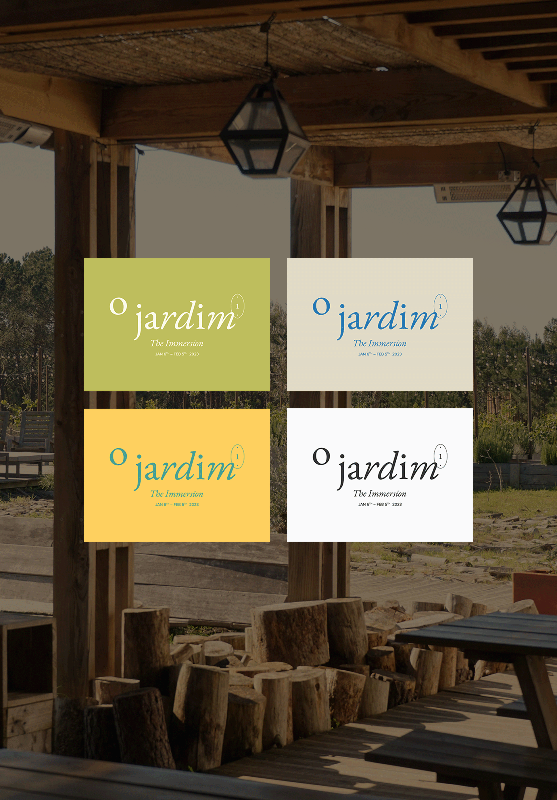
Brand color palette applications.
Each letter of the word ‘jardim’ represents the plants, the individual beings in this garden, having their own rhythm and flow. The letter ‘o’ symbolizes the moon, in this garden of expanding creative potential.
The inspiration behind the keyhole motif comes from the lineforms, shapes of keyholes in Lisbon, where the idea of the project was initially planted. It is a gateway to unlocking a curated, and soulful journey.

04
